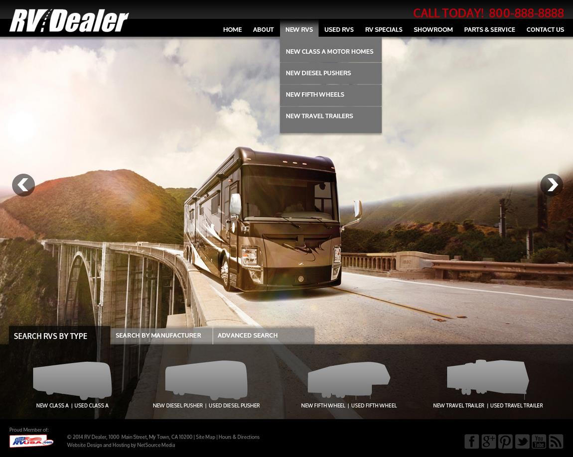
Colors attract attention, set a mood and make a statement – all things designers keep in mind when creating a website.
In fact, research shows 84.7 percent of people say color is the largest factor when choosing products. Even more interesting, most buyers make a subconscious decision about a product within 90 seconds of the initial viewing. That being said, color is one of the largest aspects to consider when designers build a website.
To get the most out of your website design, allow the designer to take the reins. Designers can see how colors interact with one another and what is going to be most aesthetically pleasing to your customers’ eyes while accurately conveying your brand’s image.
In this blog, we examine EZ-Site Designs for SiteSource 3.0 offered by NetSource Media to illustrate why a designer would choose a particular color palette for your website or ecommerce store.
RED
Red palettes signify passion and intensity – that’s why it’s the color most used for “BUY NOW” buttons. Red is known for eliciting strong emotions in buyers and creates a sense of urgency in shoppers.
Red is also the most eye-catching and intense of the “warm” colors – red, orange, and yellow. Warm color palettes can be used to convey friendliness, warmth, and comfort. As you can see in the EZ-Site Design for SiteSource 3.0 shown above, these colors generally pop out in designs and layouts, when used carefully, where “cool” colors will recede.
GREEN
Green palettes signify freshness, safety and growth. Our designers primarily use green when they’re going for a welcoming feel. When using green as a primary color, our designers usually stick with earth tones for text to keep with the fresh feel.
As seen above in the EZ-Site Design for SiteSource 3.0, a bright, vivid green can also be sporty and youthful, especially when used with pops of sky blue and a happy orange hue.
BLUE
Blue palettes signify stability, trust and serenity. Blue increases productivity and encourages self-expression, so our designers lean toward blue when working with clients that rely on trust and transparency.
Blue is one of the most popular and hard-working colors on the internet for this reason. As shown in the example above, blue is versatile (notice how the logo is a deep navy contrasted with a softer blue), yet reliable.
BLACK
Black palettes signify sophistication, wealth and exclusivity. Black is usually used for companies that sell expensive products and are looking to highlight their chic and luxury reputation.
Again, the EZ-Site Design for SiteSource 3.0 above uses the color really well. The contrast of the stark black against the warmer tones of the photo give off a feeling of class and sophistication.
___
Before you and your designer decide on the perfect colors for your site, think about your brand. After all, ultimately it’s the colors used in your site that convey your message before anyone reads the words on the page.


